In the User Experience world, loading screens are becoming increasingly more important. Let's face it - users' attention spans are shortening because of über-short TikTok videos, Facebook and Instagram reels. So, say we have a scenario where your web app needs some time to load - say, for example, when we are fetching some blog posts from an API. How do we keep the user's attention for long enough before they click off the page? Meet the humble Skeleton Loader.
So what even is a skeleton loader?
A skeleton loader is a placeholder for content, which is shown while a piece of content is loading. It quite literally looks like a "skeleton", or a blank version of your page or component, with blank outlines where content should be. There may be a plain box in place of an image for example, a circle for a profile image, or multiple lines which represent paragraphs of text.
 A custom-built skeleton card loader for a card component, built by me
Why exactly should we use them?
- They give the illusion to the user that they are waiting a shorter time for the page to load, compared to when they just have a simple loading spinner on the screen.
- They keep the UI looking consistent. Rather than jumping between two vastly different-looking screens, the skeleton loader mimics the look of the real page, which is more aesthetically pleasing.
When to use?
- When you are fetching data from an API, since this usually takes a good amount of time.
- When the component contains a large amount of content, such as a card or a large paragraph of text. This is because it will be easier to mimic the UI when there is more content to play with.
When not to use?
- When you are just loading an image, because the skeleton will just be a blank square.
- To load navbars or footers - this will just look a bit odd!
- When a user is downloading/uploading/converting files. A progress bar/indicator is much better suited in this scenario, because then the user can physically see how long they have left to wait.
How I built and implemented my skeleton loaders in Next.js
For this website, I implemented three different skeleton loaders:
- One for my card components
- One for the content on my About page
- One for each of my blog posts on my main
/blogpage.
 My custom-built About content skeleton loader
Building the templates
I created bespoke templates for each of my skeleton loaders because they needed to match the size and content type of each different element.
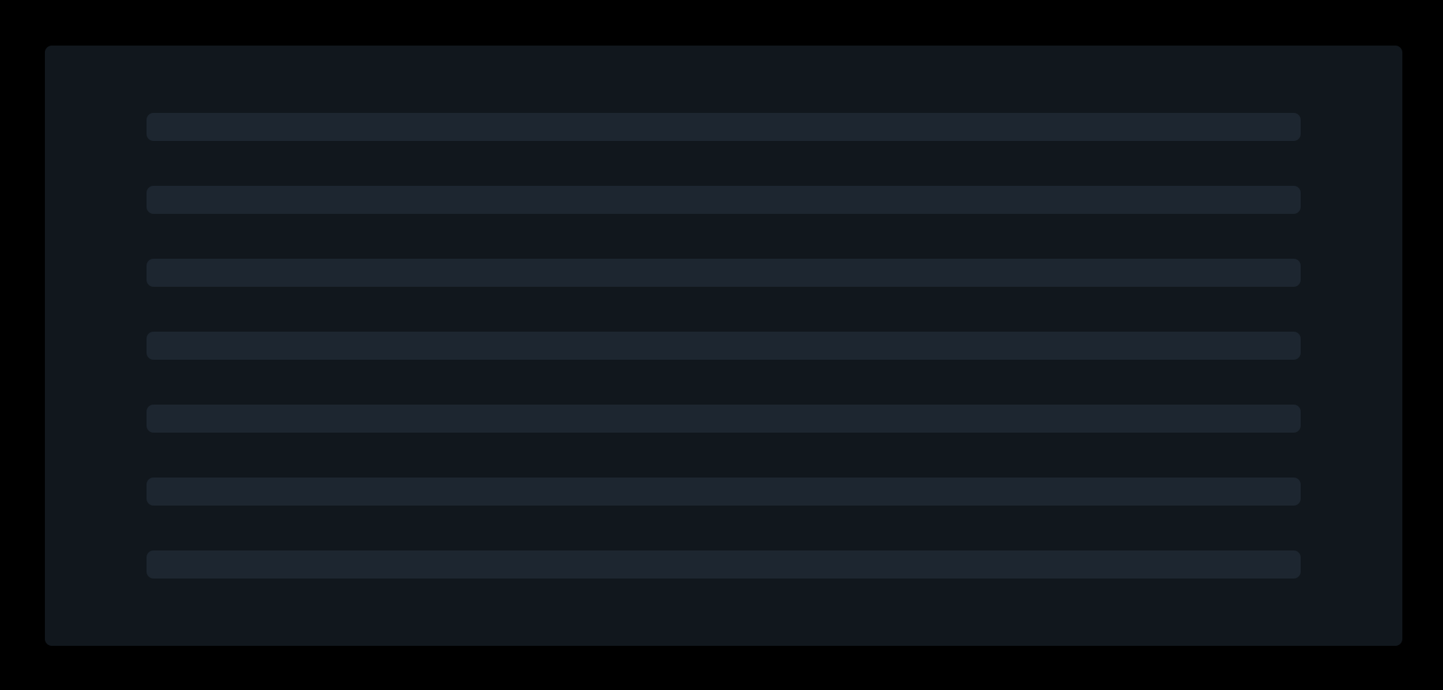
The About skeleton, for example, was quite wide and tall because my About page content takes up a large amount of the web page. It also only contains text, so the skeleton SCSS styling was pretty simple - just some thin lines to represent where the text should sit on the page when loaded.
Whereas, the card component contains an image and text, so I included both of those in the skeleton design, as well as giving the card skeleton a small width to match the shape of the card.
Rendering the skeleton
I decided to render each page's skeleton using state, and the traditional React useEffect() hook. Since Next.js isn't client-side rendered by default, I needed to specify this at the top of each file. This is done by writing 'use client;'.
I initially set the loading state to true, so that the component is loading on first load of the page. Inside the useEffect() hook, I set the state to false.
For this website, my skeleton loaders are for demonstration purpose only, since I am not loading any huge chunks of content, and I'm not grabbing any data from APIs. To mimic a longer loading time, I've placed a setTimeout() inside each useEffect(), and inside here is where I set the loading state to false.
Each setTimeout() is set to 1.5 seconds, so that you can have a peep at what my custom-built skeletons look like!